
My Role
1 Designer (me), 1 PM, 3 Devs
Mature platform with 1.5Mn DAU
1½ months (design to ship)
I was the only designer on this project, leading the redesign of Quizizz's search experience as part of the Search & Discovery team.
We focussed on driving content discovery and product adoption in the U.S. market, which includes 4Mn daily active teachers and 500K daily searches.
What is Quizizz?
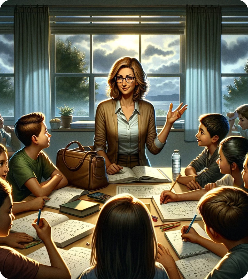
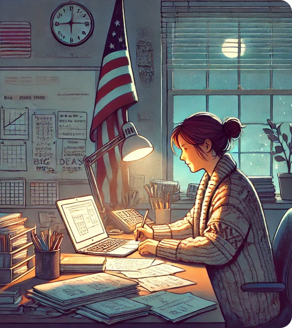
Teaching is a lot of Work

Quizizz makes learning easy & fun

Content on nearly every topic


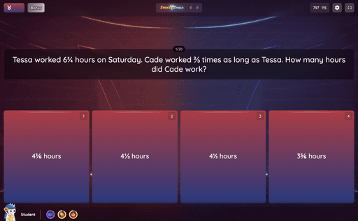
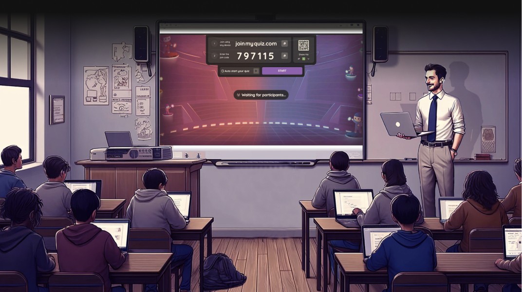
Search at Quizizz


Problem Statements
Search was not optimised for teachers’ devices

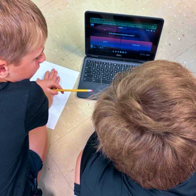
Most teachers used old chrome books with short viewports (1280px × 560px) which made their experience very frustrating.
Initially, this issue wasn't apparent, as Google Analytics and our data platforms didn’t reveal it. We first discovered the problem during user interviews and later saw this pattern consistently in Hotjar recordings. This had a direct impact on teacher engagement with the platform
Teachers didn't discover new activity formats


Teachers primarily associated Quizizz with quizzes (no pun intended!) but also used other dedicated products for formats like: interactive videos, flashcards, lessons and passages.
While Quizizz offered activities for each of these use cases, their discovery wasn’t done well yet. We had to surface these new activity formats on search
I've excluded two other problem statements from this project to try & keep the case study within a 5-minute read.
Research
Insights from 12 teacher interviews
Question
1
What does a teacher's search journey look like?
Question
2
How do teachers select activities for students?


Transcripts and notes from teacher conversations
QUERY
Express the topic and intent
SCAN
Does content match intent
REFINE
Rewrite query or
Specify preferences
SIFT
Select relevant content
Check scope, difficulty
COMMIT
Play, assign or save
Are edits required?
This journey is an abstraction based on teacher interviews, session recordings, and funnel analysis. I'd be happy to discuss nuances.
Design Explorations
Final Design
Design that got shipped
User tests
Validating ideas with teachers
↯ EXAMPLE 1 ↯
Repositioning the filters
Teachers didn’t get confused by this change. In fact, all 10 teachers easily located and applied the filters. I also realised that they often have clear, explicit preferences — so, filter discovery is not an issue when they are actively seeking it.
EXAMPLE 2 ↯
Verbose activity format names
As for Problem 2, related to new activity formats - there was significant stakeholder push for more verbose names. I was against this approach, as it created redundancy. Through these tests, validated that teachers recognised new formats and used the tabs as "legends" to identify them- without the need for long, descriptive labels.
I assessed the quality of the design by comparing their behaviours on the current experience versus the prototype - essentially a design A/B test. Observing where they faced difficulties and where things were smoother than before.
I'd like to say a few things
Until I finish writing this case study, I wanted to share a few things with you